


Custom UI Panels in Unity
Sometimes you need custom UI sliders for artists to refine later. This post covers the creation process and issues faced to get the final product (before better art was added!).Sometimes you need to create, for example, custom UI sliders so that our artists can come in later and refine them. So in this post, I'll go over the process of creating these sliders and the issues I faced to get the final product (at least before better art was added!).
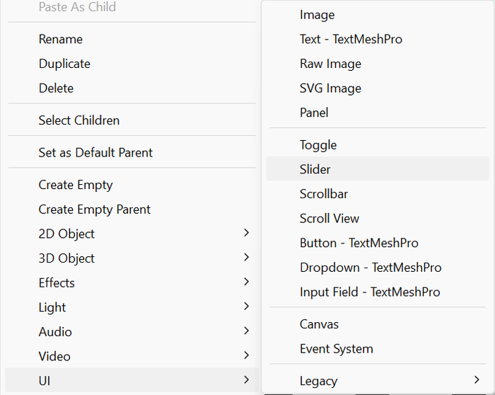
First, I needed to make the sliders themselves. In Unity, this is simple: right-click in the hierarchy, go to UI, and then select Slider.
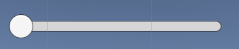
This will create something in the Unity scene that looks like this:
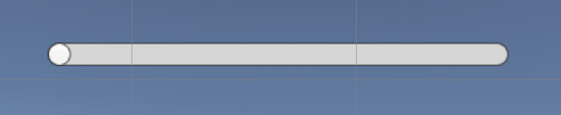
Now in the hierarchy, click on the dropdown under the new slider and notice the sections "Background", "Fill Area", and "Handle Slide Area". In my case, I was controlling the bars entirely through code and without any other actions, so I completely deleted the "Handle Slide Area" object, as it wasn't needed. This results in a bar that looks like this:
Now you need to select the object in the hierarchy called "Background" and find the Image component on it. In the "Source Image" section, select any image that will become the shape of the bar. For this step-by-step example, I'm creating the lowest piece of the cauldron I showed earlier. Next, click on the dropdown next to "Fill Area", find the Image component, and select "none" as the source image (this will make sense in a bit). Your slider should look something like this (using your own shape, of course):
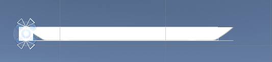
So, you might be wondering why it looks so weird. That's fine, if we go back to the Image component on the Background object, you'll see a button that says "Set Native Size". Click that button, and things will start to look better.
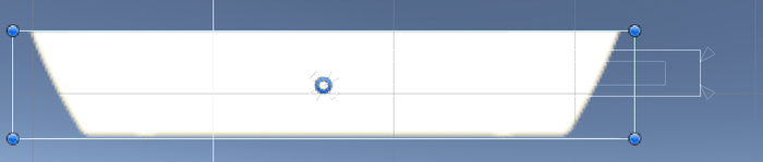
Finally, go to the "Fill Area" object. You'll notice that it currently doesn't have any components besides Rect Transform. In the area below that component, right-click. We'll add three components: Canvas Renderer, Image, and Mask.
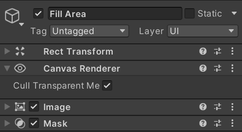
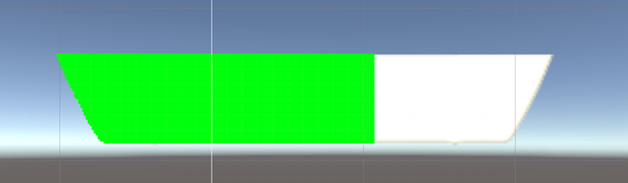
The Canvas Renderer can be left alone. In the Image component, add the image you're using for the slider shape again and set its size. You might need to tweak positioning here to get them to line up. Finally, in the "Mask" component, uncheck "Show Mask Graphic". To test if it's working, go back to the "Fill" object in the hierarchy, and in the Image component, select a color other than the default. Then, if you select the overall "Slider" object and find the "Slider" component, you can scroll it and find the "Value" slider. Try moving it up and down, and if you see the slider fill with the selected color, you're good to go! If not, I recommend double-checking the previous steps. In the Slider component, you should also uncheck "Interactable" and set the Transition drop down to None. Check those out if you need different functionality, but for the purposes of this post, they're not needed.
Now let's move on to the code.
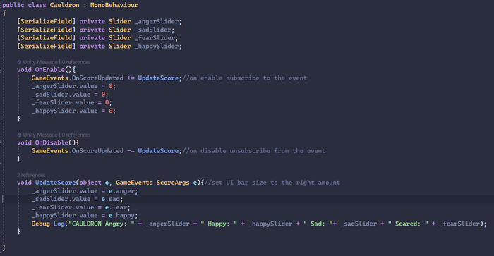
Here's all the code I used to control the sliders. Just create an empty game object in the Unity scene and drag your code onto it. Create serialized fields for the sliders to access them in code (or define the sliders in code however you like, this way is simple, especially with a small number of sliders). In our game, we use a listener function system to decouple all our objects. So whenever the score is updated by another file, it sends a signal, and any file subscribed to that signal will hear it and get the needed info. You can put this empty game object into a prefab along with the slider if you'll be spawning many different instances, like spawning lots of enemies each with their own health bar. Then just set yourSlider.value to whatever number you're trying to track. You can also set the max value (and the value at which it will appear full) using "yourSlider.maxValue = number" or set it in the Unity inspector on the slider object, slider component.