

The Good, the Bad, and the Ugly: A Story of Design and Friction
Like most things in this world, UX design is not black and white. Sometimes friction simply slows down users, but in some cases it serves an important function, such as preventing errors. How? By making the process of making mistakes longer and more difficult.
The History of UX Friction
"UX friction" sounds like a cutting-edge UX concept, but "good" friction has been around for a long time. An example is the legendary "Are you sure you want to delete this file?" Or the "Terms and Conditions" message that doesn't let you click "Agree" without even looking at it (which we all do).
The effect of friction appears in many situations unrelated to user interfaces. For example, the popular 90s indie rock band The Haven wrote in their rider that before a performance they needed a bag of M&M's, but all the brown candies must be removed. If the condition is not met, they could cancel the concert.
Why do they do this? Because they can, you might think. Rock stars can afford to be demanding and unpleasant, so why not? But such a seemingly pointless act has a very practical reason.
The purpose of this strange rider requirement was to identify insufficiently attentive and professional event organizers. The logic was: if the organizers didn't take care of the M&M's, they likely also didn't read the serious parts of the rider concerning technical requirements. Such negligence could lead to technical issues and even unsafe situations.
This is especially important when designing hazardous objects like weapons or nuclear power plants. Here, friction saves people from fatal errors.
But let's return to the history of the term "friction in design", or UX friction. So, we can't find who first used it, but we know who found a good name for it.
Joel Marsh is a UX designer, founder of Peekerton, and author of the book "UX for Beginners". In his book, he wrote about Anti-UX, and no one paid attention until he published it on Twitter. People started commenting that Anti-UX wasn't the best name and suggested calling it "appropriate friction". He decided that name was less controversial, and we can agree with that.

Creating Value Through Waiting
When you want to spend thousands of dollars on a bag or dinner, you need to... wait. For example, dinner at a trendy restaurant in your neighborhood might cost a hundred dollars, and you can book a table instantly. However, to get a table at a Michelin restaurant in Modena (Italy) with the highest star, you can't just walk in and reserve. You submit a request, then patiently wait for the restaurant to decide whether to accept you, and then wait several more months until a table becomes available.
Why are people who spent a thousand dollars forced to wait longer than those who spent a hundred or ten dollars? Because they feel more special knowing that this experience is so exclusive, and they anticipate it.
Although the outcomes are very different, both luxury restaurants and less luxurious digital products use the same effect: sometimes waiting time increases value.
In UX design, artificial "waiting time" is added to create an illusion of effort. This psychological effect is used to gain more trust from users. One of the first to use this trick was the flight booking service Kayak. After entering all data and clicking "search", Kayak doesn't show results immediately. Instead, a message appears saying the site is checking many sources to find the best connection for you. Even though it doesn't take long, the message creates a feeling that "a lot of work has been done". Thus, users valued the service more.
Many other booking services copied this idea, and now we are used to it.
How to Determine Where Design Friction Is Needed?
For this, of course, a thorough UX research is necessary. First of all, identify the most common errors. UX research methods that will be useful:
- In-depth user interviews
- User observation
- Usability testing
- Mouse/click tracking
- Surveys
- And so on...
Next, think about how to make the user flow that leads to an error more difficult.
These could be:
- Classic "Are you sure?" popup
- Make the button non-prominent, a neutral gray color
- Hiding the button
- Hiding the button even further...
But of course, this list is not exhaustive. Who knows, maybe you'll come up with something new?
An alternative to UX friction could be an "undo" option. This includes the "cancel" button and the good old trash bin that deletes files after 30 days (it's a basic thing in operating systems, but why isn't it a default option in web applications?).
The Undo Option as an Example of UX Friction
Okay, error prevention is clear, but what about other types of friction in design? Often they are not "substantial", and even if the problem is serious, it's not so easy to detect.
Do users really need that "loading" indicator on your site? Not sure. Even A/B testing doesn't always help. In most cases, it depends on the UX designer's experience and knowledge of common patterns.
Appropriate Friction vs. Inappropriate Friction
Let's define the main types of appropriate UX friction by purpose:
- Error prevention
- Enhancing perceived value
These two types of friction are more complex, as described above, but there are two more types we would like to discuss in more detail.
Entertaining Users While Waiting
Entertaining users is a different kind of goal. It appears in places where friction (waiting) is already present. It makes users learn something new or smile. At the same time, it may extend waiting time and distract them, but the overall user experience improves through positive emotions and a sense of personal connection.
For example, Duolingo offers small witty quotes or interesting facts while loading the next lesson, so users feel entertained and don't notice the friction.
Familiarizing Users with the Product
Here, all those tooltips and contextual onboarding that are very common nowadays are used. These tips attract attention, create friction, and may annoy experienced users. On the other hand, for people opening the app for the first time, such friction is beneficial because it introduces them to the product.
For example, for an MVP of a data science related product, we designed a small onboarding walkthrough to help users get started. We used pop-up messages that engage users. When you ask users to perform an action rather than just showing how the app works, they learn faster.
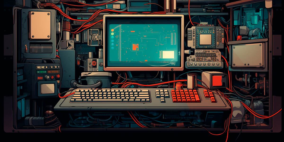
Designing Friction for SaaS User Onboarding
The onboarding we designed for the company Great Power InfluenceIt is important to make the walkthrough as short as possible. Users often get frustrated with long onboarding sequences that cannot be skipped. So we added numbers to each popup so users know how many are left until the end.
In each of these cases, a certain amount of friction is necessary. Too much friction ruins the user experience. So, when is friction harmful?
- When friction occurs at critical steps of achieving user goals, such as registration, completing a purchase, etc.
- When navigation/search/filtering are poorly designed, so finding important information like customer support or email takes forever.
- When the user flow is overly complex and causes too many errors.
- When people spend more time than expected and get annoyed (e.g., loading bars and wait spinners that take too long and frustrate users).
- When the product becomes too intrusive, trying to grab the user's attention (popups appear every time you open a page, and "unsubscribe" takes longer than adding the email address to a blacklist).
And, more interestingly, there are cases of "ugly friction" where friction is "bad" from the user's perspective but helps achieve some business goals. For example, websites where it's very difficult to contact support staff. Users may not like it, but from a business perspective, it helps minimize support requests (and in some cases, even the number of customers...).
Friction in the User Interface
To prevent such an error and avoid causing stress later, we hid the "Delete" function behind a three-dot menu. This slightly lengthens the process, as the user has to find it and click twice instead of once. That's appropriate friction.
What Does Friction in Design Teach Us?
Friction is not always good or bad. It can be appropriate, annoying, unnecessary, or necessary. The situation is what makes friction good, bad, or ugly.
The main lesson: users are not perfect, and in design we must remember that. We cannot work only with success; we must think about errors and imperfections. Because our design should not be "perfect" for designers, it should be convenient first and foremost for users.
If you feel that your product doesn't fit into common design patterns and you need professional help, contact us – we would be happy to assist you.